Between your music and a listener sits a stack of visual surfaces: the cover in a search grid, the animation behind the player, the video in a feed. Each one has its own spec, its own rules, and its own way of being ignored. This page explains what each surface actually requires, so you can build it yourself or have us build all of it for $59.
Before anyone presses play, your release is a small square competing with every other small square.
Streaming platforms want one master file: 3000x3000, square, clean. But that single file gets shown at wildly different sizes. In search results and playlist grids your cover renders around 640px or smaller, which is where most listeners meet it first. Art that looks great at full size and turns to mud at thumbnail size is the most common self-release mistake there is.
Sizing matters at the other end too. Some distributors enforce a 1,500 pixel minimum on uploads, so a cover sourced at 1400 gets bounced before it ever reaches a store. We deliver 3000 / 1500 / 1080 / 640, all cut from one master so every size matches exactly.
And because type placement matters later (keep reading), we also deliver the clean plate with no type on it and the layered file with type on its own layer. When you need a variant, nobody has to rebuild your artwork from scratch.


Both major platforms let your artwork animate behind the player. Most independent releases leave both slots empty.
A vertical looping video, 3 to 8 seconds, 9:16, that plays behind your track in the app. Spotify's own research case for it is engagement: a moving cover holds attention where a static one does not.
The good news: Canvas is self-serve. You upload it yourself through Spotify for Artists and it is live on your track the same day. No distributor involved, no review queue, no gatekeeper. This is the moving surface every artist can have, which is why it leads our Streaming Kit.
Spotify publishes no file size limit. We deliver under 10MB as our own target for reliable upload.
Apple takes two separate files: 2048x2732 portrait for iPhone and 3840x3840 square for Mac, iPad and TV. The spec is strict: 8 to 35 seconds, encoded between 45 and 100 Mbps, no audio track, and a published list of rejection reasons covering everything from held frames to visible looping seams.
It goes through your distributor, not through you. Apple accepts motion art only from distributors it has approved for it, and several popular ones are not on that list or charge their own fee to submit. That is why we sell the files, delivered to Apple's exact specification and ready for your distributor, rather than promising a placement we do not control. Check your distributor before you buy the add-on; the Canvas and the cover master work for everyone regardless.
On iPhone, Apple lays its player interface over your motion art. We measured Apple's own design template: roughly the top 17 percent and the bottom 37 percent of the portrait frame sit under interface, leaving less than half the frame fully clear.


To be precise about what this does and does not mean: none of this dictates your cover art. Apple's overlay governs the motion art submission only. Your cover stays composed for the square surfaces where it mostly lives, which is the right call, because that is where nearly all the impressions are. Most covers put the artist name at the top and the title at the bottom, and on this one surface both simply sit under the interface: not rejected, not disqualified, just invisible while the player is up.
What it does mean is that the 3:4 motion file deserves its own layout rather than a blind crop of the cover, built knowing where the interface falls. And the one shortcut Apple forecloses is shrinking the cover into the middle of the frame to dodge the overlay, which it rejects specifically. That is why the Streaming Kit builds the portrait version as its own composition, why we measure your artwork against the zones and tell you what falls where, and why we never quietly recompose your cover around one minority surface.
A streaming link pasted into a feed renders as a flat little card. The feeds reward native video, and they punish everything else with reach.
When you share your release, the platforms you share it on want their own format: vertical for Reels, TikTok and Shorts, square for feed posts, wide for YouTube and X. Posting one shape everywhere means your post is cropped, letterboxed or shrunk on most of the surfaces it lands on.
Social Share turns your artwork into nine videos: three shapes (9:16 · 1:1 · 16:9) at three lengths (30s · 60s · full song), each a true loop with your song underneath, from whichever section of the track you pick, faded in and out and mastered below -1 dBFS. Plus three endcap stills with your type on, one per shape, for thumbnails and link cards.
Delivered ready to upload. No editing app, no cropping, no guessing which export setting a platform wants.
The production standards are the product. These are the ones that matter.
What we do not promise: placement on Apple Music (that is your distributor's step and some charge for it), or any review turnaround (Apple publishes none, and anyone quoting you one is guessing). We promise files that meet the spec, and we put that through a gate rather than an opinion.
Every file below is an actual delivered artifact from a real release, playing exactly as it shipped. The first one is live on Spotify right now.
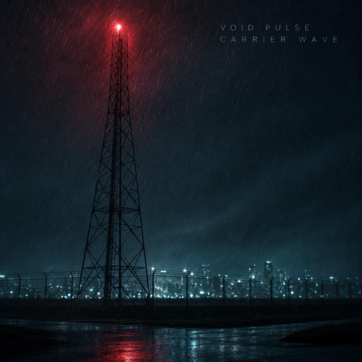
Three shapes from one Social Share pass, for a second release, The Darkest Green. Delivered files run 30s, 60s and full song; these previews are trimmed for the page.
Produced for you, delivered in 24 hours, two concepts to choose from, one revision round. Commercial license, no royalties, no attribution.
The cover master in four sizes, clean plate and layered file, your track mastered for streaming, and your cover animated as a Spotify Canvas. Add the Apple Motion Art pair for +$20.
Book a Streaming KitYour artwork cut for the feeds: nine videos across three shapes and three lengths, three endcap stills, your song underneath, ready to upload.
Book a Social ShareThe Streaming Kit, the Apple Motion Art pair, and Social Share. Every surface on this page, from one production pass, so they all match.
Take everything